
A Guide to Color Psychology in Interior Design: Creating the Perfect Mood
MI
Understanding Color Psychology
Color psychology is a fascinating field that explores how different hues influence human emotions and behavior. In interior design, understanding this can help create spaces that evoke the desired mood, whether it's a calming sanctuary or an energizing workspace.
Each color has unique psychological properties. For example, blue is often associated with calmness and serenity, while red can evoke passion and excitement. By strategically using these colors, you can transform any room into a space that meets your emotional and functional needs.

The Basics of Warm and Cool Colors
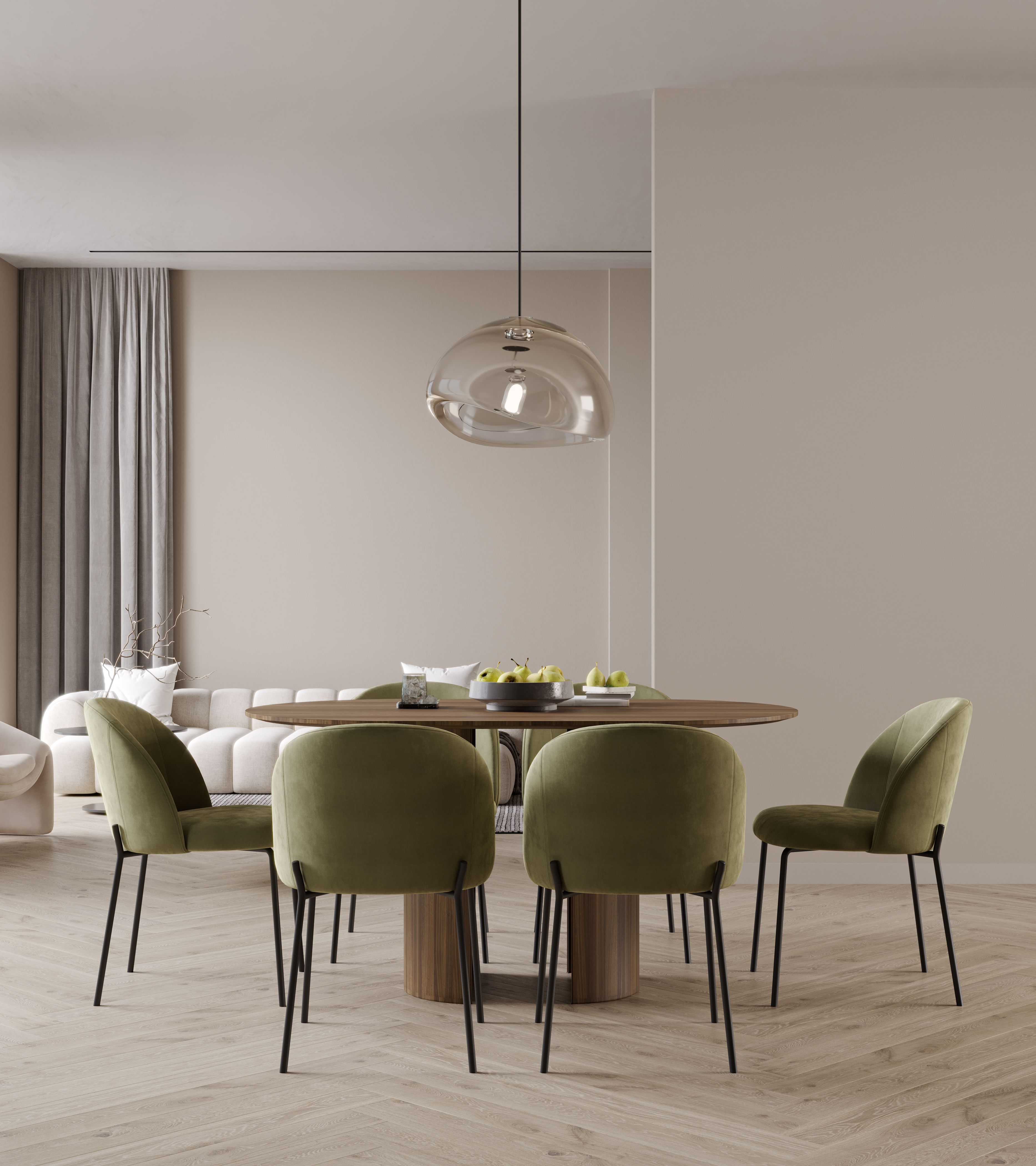
Colors are generally classified into warm and cool categories. Warm colors, such as reds, oranges, and yellows, are stimulating and can make a space feel cozy and inviting. These are ideal for social spaces like living rooms and dining areas.
On the other hand, cool colors like blues, greens, and purples tend to have a calming effect. They are perfect for bedrooms, bathrooms, and other areas where relaxation is key. Understanding this basic distinction is crucial when planning your interior design.

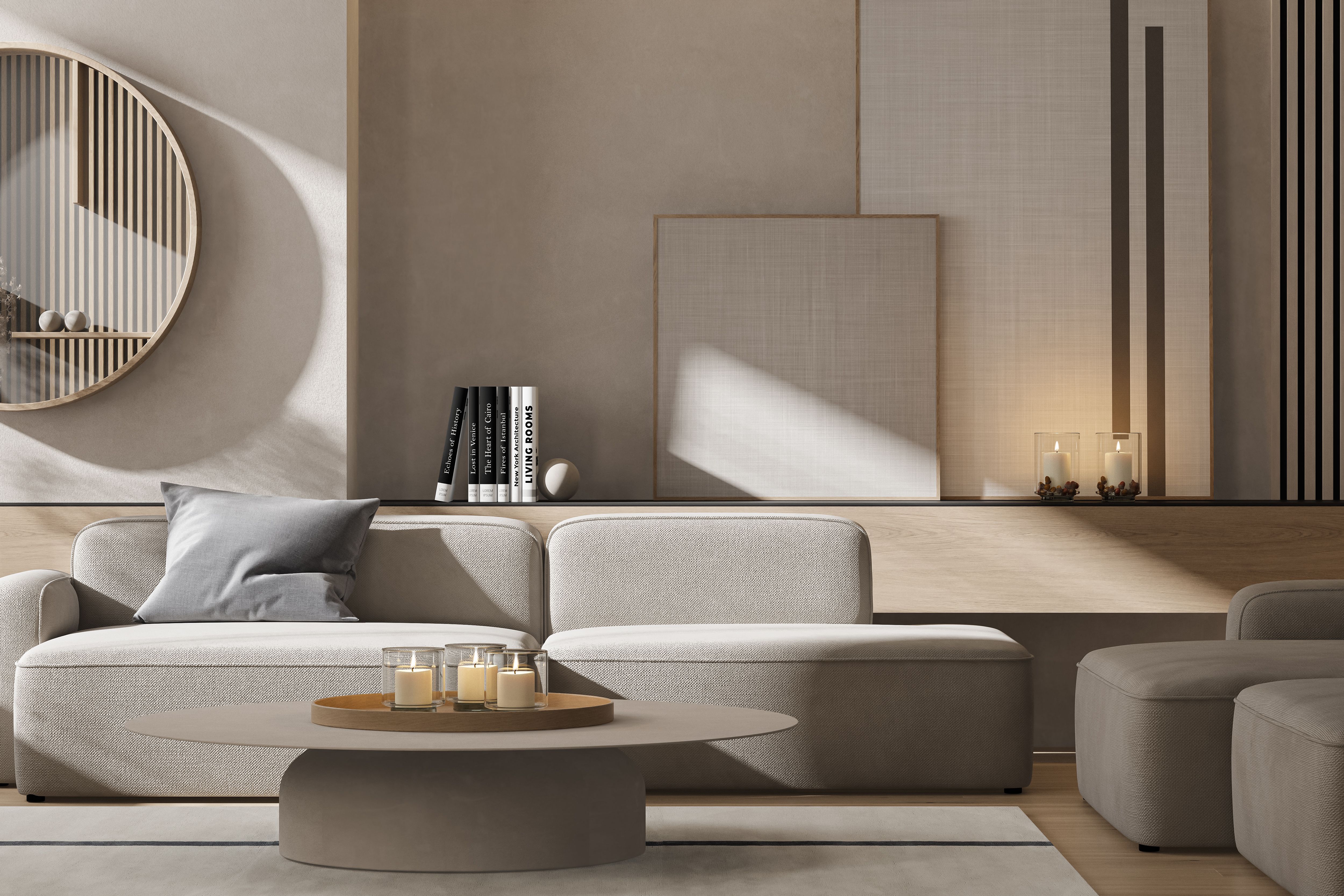
Using Neutrals Effectively
Neutrals, including whites, grays, and beiges, are essential in interior design because they provide a versatile backdrop for other colors. They can make a space feel more open and are perfect for creating a sophisticated, timeless look.
By incorporating different textures and materials, neutrals can be anything but boring. Consider using a mix of matte and glossy finishes, or combining soft fabrics with hard surfaces to add depth and interest.
Creating the Perfect Mood with Color Combinations
Combining colors effectively can further enhance the mood of a room. Here are some tips for creating harmonious color schemes:
- Monochromatic: Use varying shades of a single color for a cohesive look.
- Analogous: Combine colors that are next to each other on the color wheel for a serene effect.
- Complementary: Pair colors opposite each other on the color wheel for a vibrant contrast.
Experimenting with these combinations can lead to stunning results that perfectly align with your desired ambiance.
Color and Room Functionality
Consider the function of each room when selecting colors. For example, a home office might benefit from the concentration-boosting properties of green, while a kitchen might be invigorated with splashes of yellow to stimulate appetite and conversation.
Think about how each color reflects the purpose of the space and the activities that will take place there. This thoughtful approach ensures that the design is not only beautiful but also practical.
Conclusion
Color psychology in interior design is a powerful tool that can transform spaces into environments that enhance well-being and productivity. By understanding the effects of different colors and using them strategically, you can create a home that not only looks beautiful but also feels just right for you and your family.
Start your color journey today and discover the transformative power of well-chosen hues in your own living spaces.